Introduction
I’m going to use this post to discuss some of the aspects of data science that interest me most (tidy data as well as using data to guide strategy). I’ll be discussing these topics through the lens of a data analysis of results from a few high school golf tournaments.
I’m going to take a little bit of time to talk about tidy data. When I scraped the data used for this analysis, it wasn’t really stored in a tidy format, and there’s a good reason for that. I’ll briefly discuss what makes the original data “untidy”, and what we can do to whip it into tidy shape.
After that, I’ll explore the data a little bit, with the goal of using the findings from this analysis to
- improve strategy on the golf course
- inspire ideas for looking deeper at the data
Finally, I’ll show how we can use linear models along with mixed-effects linear models to build statistical models which allow us to quantify differences between groups of interest.
Here are the questions I hope to answer using the data:
- What are the most difficult holes? Why are they difficult?
- What is the easiest hole? What makes it easier than the rest?
- Are there clear differences in scores between regional and sectional golf tournaments?
- What separates the better high school golfers (those that break 90) from the other golfers?
- What are some general strategy guidelines for playing this golf course?
All of the analysis in this post was performed using R. I’ve omitted some of the code used to generate plots to improve readability. The full .Rmd file can be found on my GitHub.
Some Useful Context
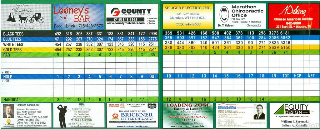
This analysis will involve looking at results from WIAA golf tournaments that were hosted at Pine Valley Golf Course (PV). Since 2011, either a regional or sectional tournament was played at PV for Division 3 high schools. Pine Valley is a par 71 golf course, with two par 3’s, six par 4’s and one par 5 on the front nine, and two par 3’s, five par 4’s and two par 5’s on the back nine. Here’s an image of the scorecard:
Regional tournaments come before sectionals, with teams and individuals that played well in the regional tournament advancing to sectionals. Teams and individuals that play well in the sectional tournament will advance to the state tournament. It is a fair (and testable!) hypothesis that scores will tend to be better in sectional tournaments.
Hitting the Range: Show me the data
First I’m going to load a few packages.
library(tidyverse)
library(scales)
library(lme4)
theme_set(theme_bw())
I’ve already scraped the data and cleaned it up a bit. I’ve thrown the code and data in a github repository.
gh <- "https://raw.githubusercontent.com/bgstieber/files_for_blog/master/golf-tidy-data/data"
# read in data and only keep scores lower than 121
tidy_scores <- read_csv(paste0(gh, '/tidy_golf_scores.csv')) %>%
  filter(tot <= 120)
untidy_scores <- read_csv(paste0(gh, '/untidy_golf_scores.csv')) %>%
  filter(tot <= 120)
The data is comprised of 472 golfers with scores for each of the 18 holes they played. In total, there are 8496 scores in this data set.
Let’s take a peek at the first few rows of each data set. The first data set we’ll look at is the untidy data, this is fairly close to what the WIAA provides on the webpages for each of the tournaments.
| name | year | 1 | 2 | 3 | 4 | 5 | 6 | 7 | 8 | 9 | out | 10 | 11 | 12 | 13 | 14 | 15 | 16 | 17 | 18 | in | tot | tourn_type | tourn_year |
|---|---|---|---|---|---|---|---|---|---|---|---|---|---|---|---|---|---|---|---|---|---|---|---|---|
| A1 | 12 | 7 | 4 | 4 | 4 | 5 | 4 | 5 | 6 | 6 | 45 | 6 | 5 | 5 | 5 | 7 | 4 | 5 | 4 | 5 | 46 | 91 | sectionals | 2011 |
| A2 | 12 | 5 | 5 | 5 | 5 | 4 | 3 | 5 | 5 | 4 | 41 | 5 | 6 | 5 | 5 | 5 | 7 | 5 | 3 | 5 | 46 | 87 | sectionals | 2011 |
| A3 | 12 | 7 | 5 | 6 | 6 | 5 | 6 | 5 | 5 | 4 | 49 | 6 | 6 | 6 | 4 | 7 | 6 | 7 | 4 | 5 | 52 | 101 | sectionals | 2011 |
| A4 | 11 | 8 | 5 | 5 | 5 | 7 | 7 | 5 | 5 | 4 | 51 | 6 | 7 | 5 | 4 | 5 | 4 | 5 | 4 | 5 | 45 | 96 | sectionals | 2011 |
| A5 | 11 | 14 | 4 | 5 | 4 | 3 | 6 | 7 | 4 | 4 | 51 | 6 | 6 | 11 | 9 | 7 | 8 | 5 | 5 | 7 | 64 | 115 | sectionals | 2011 |
| A6 | 11 | 6 | 4 | 4 | 6 | 5 | 4 | 5 | 4 | 3 | 41 | 4 | 5 | 7 | 4 | 6 | 5 | 6 | 3 | 4 | 44 | 85 | sectionals | 2011 |
This is an example of a “wide” data set.
Now let’s take a look at the first few rows of the tidy data.
| name | year | out | in | tot | tourn_type | tourn_year | hole | score | par | ob | water | side | rel_to_par |
|---|---|---|---|---|---|---|---|---|---|---|---|---|---|
| A1 | 12 | 45 | 46 | 91 | sectionals | 2011 | 1 | 7 | 5 | TRUE | TRUE | front | 2 |
| A2 | 12 | 41 | 46 | 87 | sectionals | 2011 | 1 | 5 | 5 | TRUE | TRUE | front | 0 |
| A3 | 12 | 49 | 52 | 101 | sectionals | 2011 | 1 | 7 | 5 | TRUE | TRUE | front | 2 |
| A4 | 11 | 51 | 45 | 96 | sectionals | 2011 | 1 | 8 | 5 | TRUE | TRUE | front | 3 |
| A5 | 11 | 51 | 64 | 115 | sectionals | 2011 | 1 | 14 | 5 | TRUE | TRUE | front | 9 |
| A6 | 11 | 41 | 44 | 85 | sectionals | 2011 | 1 | 6 | 5 | TRUE | TRUE | front | 1 |
On inspection, there are some clear differences between the tidy and untidy data sets.
Putting Practice: What makes data tidy?
In some ways, recognizing tidy/untidy data can be one of those I know it when I see it things. We can follow the fairly solid guidelines Hadley Wickham has proposed to make the distinction a bit more concrete (if you haven’t read that paper, I highly recommend it):
- Each variable is a column
- Each observation is a row
- Each type of observational unit is a table (this isn’t as important for this post)
It’s important to think about those two bolded words within the context of this analysis. We’re interested in making our way around a golf course, to hopefully play our best. Playing our best means minimizing mistakes throughout a round of golf.
Some people like to think of golf as a game composed of 18 “mini games” within it. For an analysis with the primary focus of identifying ways to get around the course as strategically as possible, I think the best way to look at the data is to have each observational unit be the score on one hole for each competitor. Our tidy data set is constructed this way, with one row per competitor per hole. The untidy data has a structure of one row per competitor. This structure may be useful if we’re only interested in looking at final scores for each competitor. It’s also useful for a concise summary of a competitor’s performance on a website (which was its original purpose).
Transforming the data from untidy to tidy is fairly simple using the gather function from the tidyr package.
untidy_scores %>%
  # only select a handful of columns to make printing easier
  select(-year, -out, -`in`, -tot, -tourn_type, -tourn_year) %>%
  gather(hole, score, -name)
## # A tibble: 8,496 x 3
## name hole score
## <chr> <chr> <dbl>
## 1 A1 1 7
## 2 A2 1 5
## 3 A3 1 7
## 4 A4 1 8
## 5 A5 1 14
## 6 A6 1 6
## 7 A7 1 7
## 8 A8 1 6
## 9 A9 1 7
## 10 A10 1 11
## # ... with 8,486 more rowsNow that we have the data in a way that should be straightforward to analyze, let’s start taking a look at some summaries of the results from these competitions.
Teeing Off: Exploring the Data
We could either look at the scores on each hole or we could look at the score relative to par for each hole. Scores will generally be higher depending on the par of the hole. Par 3’s are shorter than par 4’s which are shorter than par 5’s, and the longer the hole the more strokes (usually) it will take to complete. Since this represents an inherent “bias” in the score data, I think it’s better to analyze the score relative to par.
First, we’ll visualize the distribution of scores relative to par.
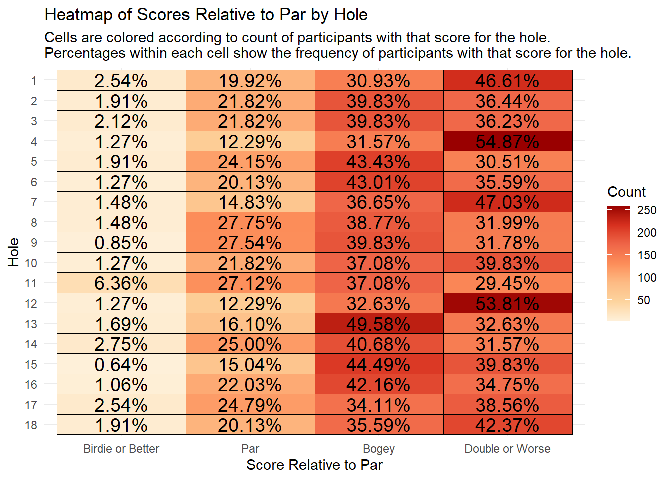
We’re able to see a few things pretty quickly from the heatmap above:
- Holes 4 and 12 are clearly the hardest on the course, with over 50% of the field making double bogey or worse
- Hole 11 is the easiest on the course, with the highest percentage of the field making a birdie or better, and the lowest percentage making double or worse.
- About 50% of the field made a bogey on 13, which is a par 3
Next, we’re going to take a look at the average score relative to par for each of the 18 holes played at PV. Each of the 18 holes played at least one stroke over par.
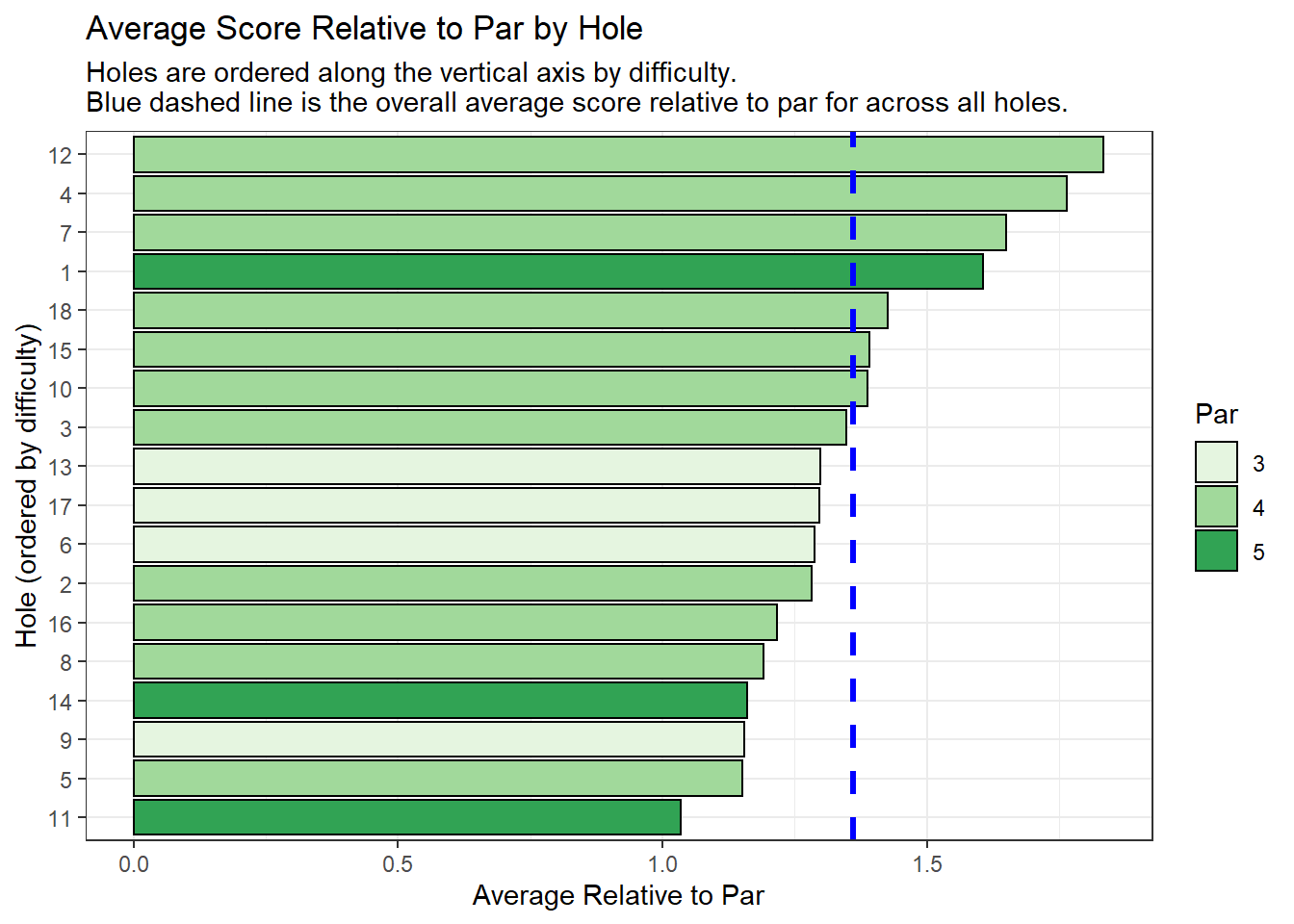
The four hardest holes are (in order of difficulty): 12, 4, 7, and 1.
PV was my home course growing up, so here’s a little local knowledge about each of those holes.
Hole 12
12 is the longest par 4 on the course, playing at about 430 yards from the back tees. The tee shot can be intimidating with out-of-bounds along the left, and some trees and mounds on the right. This hole seemed to play into the wind more often than downwind, making it even longer than the 430 yards on the card.
Hole 4
4 is rated as the hardest hole on the golf course according to the USGA handicapping system. The tee shot can be somewhat difficult, with out-of-bounds, trees, and water on the left, and more trees on the right. That being said, the hole is not overly long, so hitting something less than driver is not a bad route. The green is guarded by a stream in front of it, and hilly terrain surrounding it. Putting on this green can be difficult, as it has a lot of slope and undulation.
Hole 7
7 is a short dogleg left. The main difficulty on this hole is the tight dogleg golfers must navigate off the tee. There are trees which can block an approach shot if the tee shot veers too far right, and hills along with trees and water on the left side for those getting too aggressive off the tee. The approach into the green (provided one has a clear shot) is not that difficult, with no bunkers and a lot of room to miss. The major difficulty on this hole is the tee shot, but from there it’s fairly straightforward.
Hole 1
1 is a shorter par 5 with a daunting tee shot. There’s OB on the left side, and trees and fescue along the right side. On top of that, a golfer must steady their first tee jitters and focus on hitting a solid tee shot in front of the “gallery” of other players, coaches, and spectators. After hitting the tee shot, the fun doesn’t end. The approach into the green is challenging, as trees surround the green and the hole narrows all the way into the green
Each of the four most difficult holes requires a well-struck tee shot. On the 12th, it’s important to hit a long and straight shot. The 4th and 1st holes require precision and steady nerves to avoid trouble and hit a narrow fairway. The 7th requires a controlled and well-executed tee shot that is shaped right to left.
The next visualization is a lollipop chart, which is a great way to avoid the “visually aggressive” moire effect that bar charts can sometimes fall victim to without losing the perceptually sound concept of position along a common scale. Julia Silge uses this chart type to great effect in some of her blog posts.
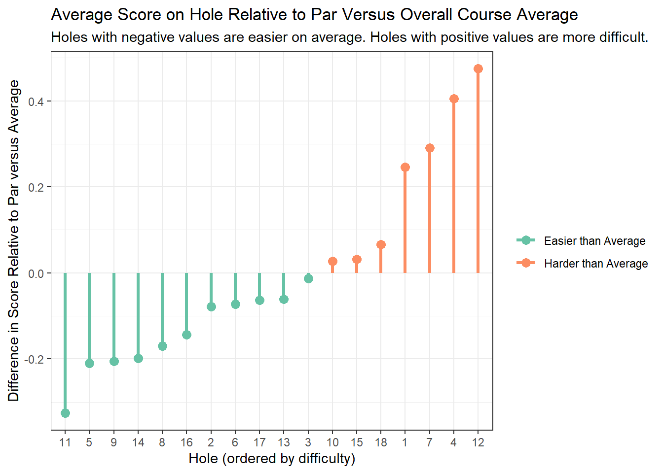
We took the same data that was displayed in the previous chart, but augmented it slightly to tell a different story. The orange lollipops on the chart show the holes that have higher scores relative to par than average. Three of the four hardest holes are on the front nine, occurring in the first seven holes of the course. We can also see how much more difficult holes 1, 4, 7, and 12 are than the rest (the “sticks” of the lollipops rise much higher than the other holes which played harder than average).
The easiest holes on the course can be identified as well. Hole 11 stands out as being the easiest hole at PV. Hole 11 is a straightforward par 5 with almost no trouble off the tee and a fairly generous fairway all the way to the green. The hole typically plays downwind (it’s routed in the opposite direction of 12), allowing longer hitters the option of trying to reach it in two.
Making the Turn: Statistical Modeling
After a bit of exploratory analysis, we can move on to using statistical modeling to briefly investigate the differences between holes with a little more precision. Additionally, we can use a simple model to test the hypothesis that scores (in relation to par) will be lower at sectional tournaments as opposed to regional.
First, we’ll fit a linear mixed-effects model. I haven’t really worked with mixed-effects models too much since grad school, but this model shouldn’t be too hard to describe.
# create factor variables for tournament year and hole to make
# modeling a bit easier
hardest_holes <- c(12L, 4L, 7L, 1L, 18L,
                   15L, 10L, 3L, 13L,
                   17L, 6L, 2L, 16L,
                   8L, 14L, 9L, 5L, 11L)

tidy_scores2 <- tidy_scores %>%
  mutate(tourn_year_f = factor(tourn_year),
         hole_f = factor(hole,levels = hardest_holes))
## look at past performance to find most difficult holes
simple_mod <- lmer(rel_to_par ~ hole_f+tourn_type+(1|tourn_year_f)+(1|tourn_year_f:name),
                   data = tidy_scores2)
In the model above, we’re fitting fixed effects for the hole variable and the tournament type variable. We’re using (1|tourn_year_f) to fit a random effect for the tournament year, and using (1|tourn_year_f:name) to fit a random effect for the competitor nested within tournament year. A simple way to think about the fixed versus random effects divide is that if we’re interested in understanding the impact of a variable on our target, we should probably fit it as a fixed effect, if we’re not that interested a random effect is the way to go (this is a gross over-simplification, I’d see this post if you’re looking for something more in-depth).
Alright, so we fit the model, now what?
Check out the coefficients
Let’s see what a summary of the model looks like
summary(simple_mod)$coefficients## Estimate Std. Error t value
## (Intercept) 1.88291299 0.09070789 20.757985
## hole_f4 -0.06991525 0.06812175 -1.026328
## hole_f7 -0.18432203 0.06812175 -2.705774
## hole_f1 -0.22881356 0.06812175 -3.358891
## hole_f18 -0.40889831 0.06812175 -6.002463
## hole_f15 -0.44279661 0.06812175 -6.500077
## hole_f10 -0.44703390 0.06812175 -6.562278
## hole_f3 -0.48728814 0.06812175 -7.153194
## hole_f13 -0.53601695 0.06812175 -7.868514
## hole_f17 -0.53813559 0.06812175 -7.899615
## hole_f6 -0.54661017 0.06812175 -8.024018
## hole_f2 -0.55296610 0.06812175 -8.117321
## hole_f16 -0.61864407 0.06812175 -9.081447
## hole_f8 -0.64406780 0.06812175 -9.454657
## hole_f14 -0.67372881 0.06812175 -9.890069
## hole_f9 -0.68008475 0.06812175 -9.983371
## hole_f5 -0.68432203 0.06812175 -10.045573
## hole_f11 -0.80084746 0.06812175 -11.756119
## tourn_typesectionals -0.06353004 0.09519262 -0.667384These results aren’t too interesting, but note that I set up the hole factor variable to compare the other holes to #12, the hardest on the course. The only hole that wasn’t significantly easier than 12 was #4.
We can also look at the estimate for the tourn_type variable. Directionally, we got the result we were expecting, i.e. sectionals have lower scores relative to par than regionals on average. However, the coefficient is not significant (thumb rule \(|t| < 2\)) and its effect size is small, indicating that although the directional effect is negative, we’d have a hard time concluding that the effect is really that meaningful.
Oh well, let’s do something more interesting with the results from the model
Pulling by our bootstraps
What I really want is to be able to visualize not only the difficulty of the holes (i.e. a point estimate), but also look at the uncertainty in that difficulty.
Using the solution from this CrossValidated post, we’ll use the bootstrap to generate predictions on a “dummy” data set.
# initial setup
dummy_table <- tidy_scores2 %>%
  select(hole_f, tourn_type) %>%
  unique()

# taken from https://stats.stackexchange.com/a/147837/99673
predFun <- function(fit) {
  predict(fit, dummy_table, re.form = NA)
}
# fit the bootstrap...takes a longish time
bb <- bootMer(simple_mod,
              nsim = 500,
              FUN = predFun,
              seed = 101)
After munging the data a bit, we’re left with a data set of predictions from the bootstrap.
# use the results from the boostrapped model
dummy_table_boot <- cbind(dummy_table, t(bb$t)) %>%
  gather(iter, rel_to_par, -hole_f, -tourn_type) %>%
  mutate(hole_n = as.numeric(as.character(hole_f)))

dummy_table_boot %>% head
## hole_f tourn_type iter rel_to_par hole_n
## 1 1 sectionals 1 1.586058 1
## 2 1 regionals 1 1.637165 1
## 3 2 sectionals 1 1.293660 2
## 4 2 regionals 1 1.344768 2
## 5 3 sectionals 1 1.262038 3
## 6 3 regionals 1 1.313146 3We can use these results to visualize the distributions of predictions.
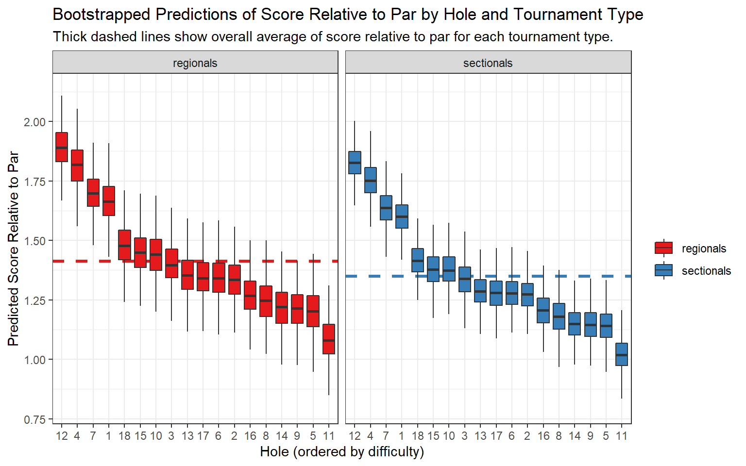
We see that for both regional and sectional tournaments, holes 1, 4, 7, and 12 were much more difficult than the rest. We can also see that scores relative to par were slightly higher for regional tournaments, and that scores tended to vary a bit more in regional tournaments (the boxes for regionals tend to be a bit longer).
As I’ll mention in the conclusion of this post, I think we could dive a bit deeper into the mixed-effects models and potentially investigate interaction effects, or build some more interesting models using feature engineering, but this is as far as I want to go for this post.
Walking up 18: What Separates the Best from the Rest
Finally, we’re going to take a look at what separates the golfers that broke 90 from the rest of the field.
To make the next visualization, we’ll use a little bit of map_df magic from the purrr package to make a plot that is a cousin of the q-q plot.
seq(0,1,.025) %>%
  map_df(~untidy_scores %>%
           group_by(tourn_type, 'p' = .x) %>%
           summarise('perc' = quantile(tot, .x))) %>%
  ggplot(aes(p, perc, colour = tourn_type))+
  geom_point(size = 2)+
  scale_x_continuous('Percentile (lower is better)', labels = percent)+
  scale_y_continuous(breaks = seq(70, 160, 10),
                     name = 'Final Score')+
  scale_colour_brewer(palette = 'Set1',
                      name = '')+
  ggtitle('Final Score Percentile Plot by Tournament Type')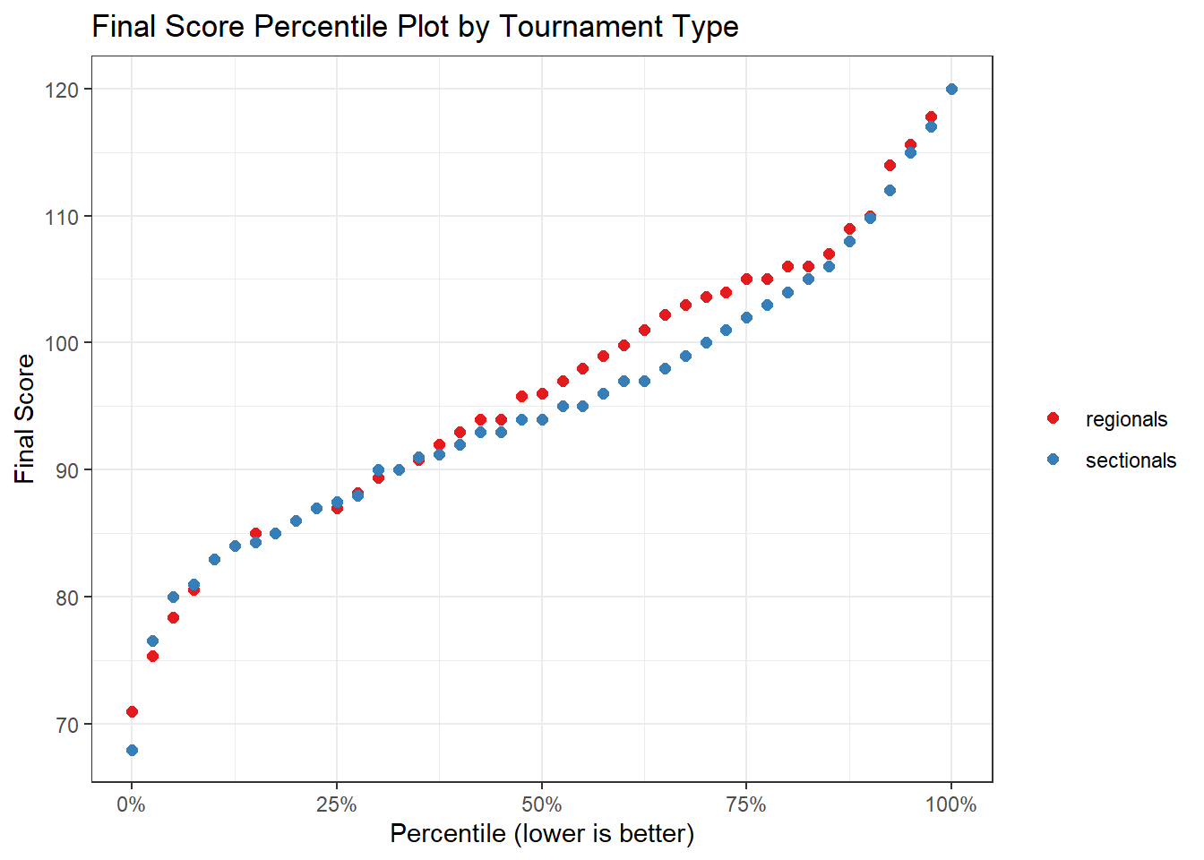
Breaking 90 is generally a sign of a fairly accomplished high school golfer. In the plot above, we can see that the 90 mark is right around the 30th percentile for both the regional and sectional tournaments. This means that about 30% of the competitors scored 90 or lower. One other interesting insight from this chart is that the performance between the regional and sectional tournament is fairly similar (the scores by percentile are pretty close) except for between the 50th and 75th percentiles (the red dots tend to rise a bit above the blue). It could be interesting to dig into this divergence a bit more in a follow-up analysis.
To explore the difference between those that broke 90 (30% of the field) from those that didn’t, we’ll fit a simple linear model. We’ll use the results of the model to make predictions on a dummy data set and then look at the differences between predicted scores relative to par for each hole for the top 30% and the bottom 70%. We use a linear model to give our analysis a bit more precision than using simple averages across the data. We could also return to this analysis and investigate the coefficients or add complexity to the model if appropriate.
tidy_scores3 <- tidy_scores2 %>%
  mutate(broke_90 = ifelse(tot < 90, 'Broke 90', 'Did not Break 90'))
# linear model with effects for hole, broke_90 indicator
# and interaction between hole and broke_90
fit2 <- lm(rel_to_par ~ hole_f * broke_90, data = tidy_scores3)

dummy_table2 <- tidy_scores3 %>%
  select(hole_f, broke_90) %>%
  unique()

cbind(dummy_table2,
      predict(fit2, newdata = dummy_table2, interval = 'prediction')) %>%
  select(hole_f, broke_90, fit) %>%
  spread(broke_90, fit) %>%
  mutate(diff_avg = `Did not Break 90` - `Broke 90`) %>%
  ggplot(aes(reorder(hole_f, -diff_avg), diff_avg))+
  geom_col()+
  xlab('Hole (ordered by average difference)')+
  ylab('Average Stroke Improvement from Bottom 70% to Top 30%')+
  ggtitle('Where do the Better Golfers Shine?',
          subtitle = paste0('The golfers finishing in the top 30% tended to',
                            ' perform better on the more difficult holes.'))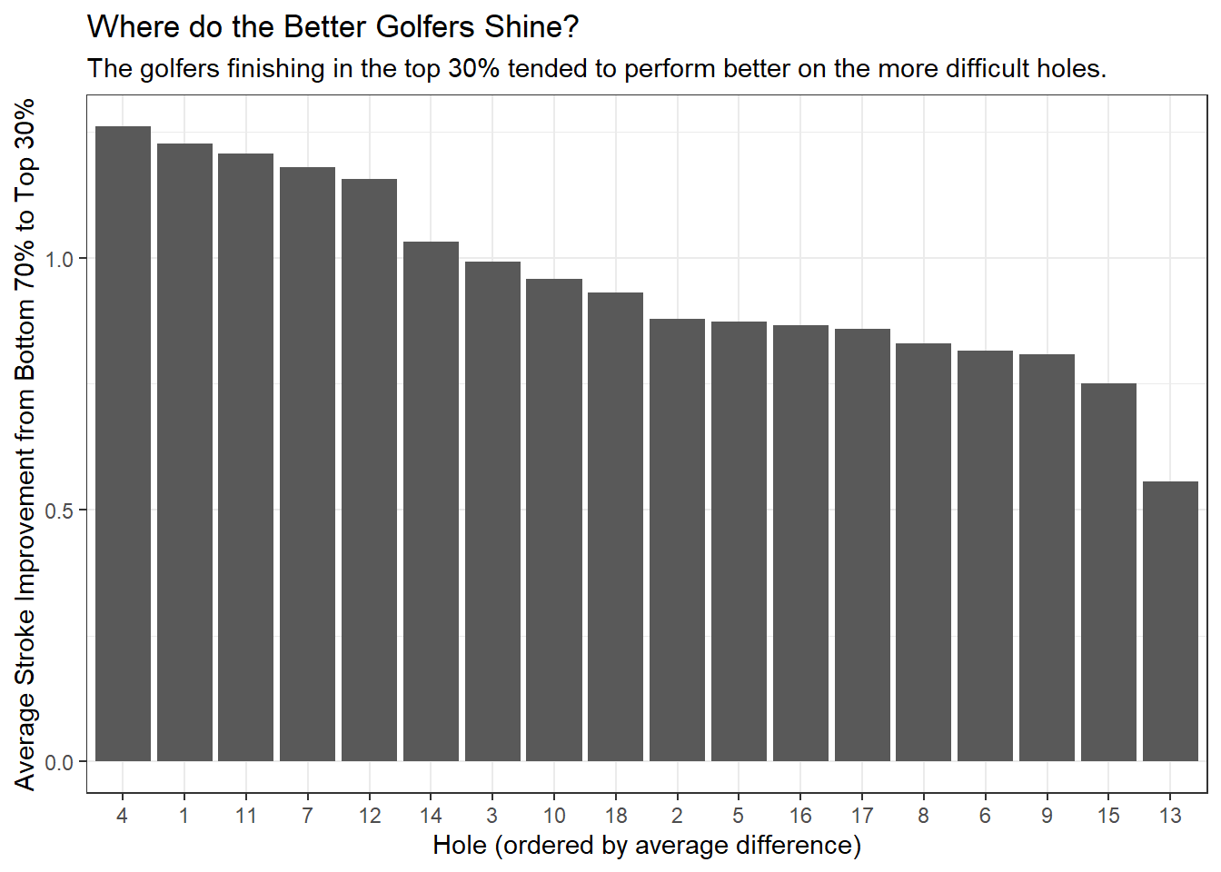
The chart above demonstrates two clear reasons why the top 30% fared better than the rest:
- They played the hardest holes better
- The top 30% were more than a stroke better than the bottom 70% on holes 1, 4, 7, and 12
- They took advantage of the easiest holes
- The top 30% were also more than a stroke better than the bottom 70% on hole 11 (the easiest hole on the course)
The results from this quick analysis show that the better players take advantage of the easiest holes and minimize their mistakes on the hardest holes.
Signing the Scorecard: Final Thoughts and Summary
In this blog post I talked about tidy data and used data analysis to inform decisions on the golf course. Of course, data science can be used to do more than just guide golfers to lower scores, but I thought it was an interesting application.
The four toughest holes were 1, 4, 7, and 12. Each of these holes require thought off the tee, and some holes have challenging approach shots to the green. We saw that players who broke 90 tended to outperform their higher-scoring counterparts on these holes by more than a stroke.
The easiest hole was number 11, a straightforward par 5 with little trouble, a generous fairway, and usually has a helping wind. This hole had the highest percentage of birdies on the course, and the top golfers took advantage of it. The top 30% played this hole more than a stroke better than the bottom 70%.
It was difficult to identify clear differences between the results from regional and sectional tournaments, but we did see some divergence in final scores between the 50th through 75th percentiles.
We can use the results from this analysis to guide golfers’ strategy a bit. First, they should take advantage of hole 11, as there is almost no risk to being aggressive on this hole. Second, they should think carefully and formulate a game plan for the tee shots on 1, 4, 7, and 12. These holes play as the most difficult, and a lot of the challenge comes from the tee shot. Finally, it’s always a good idea to remember that you’re playing golf, and that it’s a game and it’s supposed to be fun!
In this blog post I used some data science techniques to explore an interesting data set. I think this analysis could be expanded to include more statistical modeling aided by some feature engineering (are there certain characteristics of holes we should investigate? what about player characteristics?). We could also dig deeper into the top 30% and try to determine differences within that group, to find commonalities among the best of the best. Finally, it might be interesting to use data from a weather service to identify which years had difficult conditions, and estimate a rain or wind effect on final scores.
Thanks for reading this post and feel free to leave a comment below if you have any thoughts or feedback!