This post will provide an R code-heavy, math-light introduction to selecting the \(k\) in k means. It presents the main idea of kmeans, demonstrates how to fit a kmeans in R, provides some components of the kmeans fit, and displays some methods for selecting k. In addition, the post provides some helpful functions which may make fitting kmeans a bit easier.
kmeans clustering is an example of unsupervised learning, where we do not have an output we’re explicitly trying to predict. We may have reasons to believe that there are latent groups within a dataset, so a clustering method can be a useful way to explore and describe pockets of similar observations within a dataset.
The Algorithm
Here’s basically what kmeans (the algorithm) does (taken from K-means Clustering):
- Selects K centroids (K rows chosen at random)
- Assigns each data point to its closest centroid
- Recalculates the centroids as the average of all data points in a cluster (i.e., the centroids are p-length mean vectors, where p is the number of variables)
- Assigns data points to their closest centroids
- Continues steps 3 and 4 until the observations are not reassigned or the maximum number of iterations (
Ruses 10 as a default) is reached.
Here it is in gif form (taken from k-means clustering in a GIF):
A balls and urns explanation
As a statistician, I have hard time avoiding resorting to using balls and urns to describe statistical concepts.
Suppose we have \(n\) balls, and each ball has \(p\) characteristics, like \(shape\), \(size\), \(density\), \(\ldots\), and we want to put those \(n\) balls into \(k\) urns (clusters) according to the \(p\) characteristics.
First, we randomly select \(k\) balls (\(balls_{init}\)), and assign the rest of the balls (\(n-k\)) to whichever \(balls_{init}\) it is closest to. After this first assignment, we calculate the centroid of each (\(k\)) collection of balls. The centroids are the averages of the \(p\) characteristics of the balls in each cluster. So, for each cluster, there will be a vector of length \(p\) with the means of the characteristics of the balls in that cluster.
After the calculation of the centroid, we then calculate (for each ball) the distances between its \(p\) characteristics and the centroids for each cluster. We assign the ball to the cluster with the centroid it is closest to. Then, we recalculate the centroids and repeat the process. We leave the number of clusters (\(k\)) fixed, but we allow the balls to move between the clusters, depending on which cluster they are closest to.
Either the algorithm will “converge” and between time \(t\) and \(t+1\) no reassignments will occur, or we’ll reach the maximum number of iterations allowed by the algorithm.
##kmeans in R
Here’s how we use the kmeans function in R:
kmeans(x, centers, iters.max, nstart)arguments
xis our datacentersis the k in kmeansiters.maxcontrols the maximum number of iterations, if the algorithm has not converged, it’s good to bump this number upnstartcontrols the initial configurations (step 1 in the algorithm), bumping this number up is a good idea, since kmeans tends to be sensitive to initial conditions (which may remind you of sensitivity to initial conditions in chaos theory)
###values it returns
kmeans returns an object of class “kmeans” which has a print and a fitted method. It is a list with at least the following components:
cluster - A vector of integers (from 1:k) indicating the cluster to which each point is allocated.
centers - A matrix of cluster centers these are the centroids for each cluster
totss - The total sum of squares.
withinss - Vector of within-cluster sum of squares, one component per cluster.
tot.withinss - Total within-cluster sum of squares, i.e. sum(withinss).
betweenss - The between-cluster sum of squares, i.e. totss-tot.withinss.
size - The number of points in each cluster.
To use kmeans, we first need to specify the k. How should we do this?
##Data
For this post, we’ll be using the Boston housing data set. This dataset contains information collected by the U.S Census Service concerning housing in the area of Boston, MA.
##      crim zn indus   nox    rm  age    dis rad tax ptratio  black lstat medv
## 1 0.00632 18  2.31 0.538 6.575 65.2 4.0900   1 296    15.3 396.90  4.98 24.0
## 2 0.02731  0  7.07 0.469 6.421 78.9 4.9671   2 242    17.8 396.90  9.14 21.6
## 3 0.02729  0  7.07 0.469 7.185 61.1 4.9671   2 242    17.8 392.83  4.03 34.7
## 4 0.03237  0  2.18 0.458 6.998 45.8 6.0622   3 222    18.7 394.63  2.94 33.4
## 5 0.06905  0  2.18 0.458 7.147 54.2 6.0622   3 222    18.7 396.90  5.33 36.2
## 6 0.02985  0  2.18 0.458 6.430 58.7 6.0622   3 222    18.7 394.12  5.21 28.7
Visualize within Cluster Error
Use a scree plot to visualize the reduction in within-cluster error:
ss_kmeans <- t(sapply(2:14,
                  FUN = function(k)
                  kmeans(x = b_housing,
                         centers = k,
                         nstart = 20,
                         iter.max = 25)[c('tot.withinss','betweenss')]))

plot(2:14, unlist(ss_kmeans[,1]), xlab = 'Clusters', ylab = 'Within Cluster SSE')
When we look at the scree plot, we’re looking for the “elbow”. We can see the SSE dropping, but at some point it discontinues its rapid dropping. At what cluster does it stop dropping abruptly?
Stated more verbosely from Wikipedia:
The elbow method looks at the percentage of variance explained as a function of the number of clusters: One should choose a number of clusters so that adding another cluster doesn’t give much better modeling of the data. More precisely, if one plots the percentage of variance explained by the clusters against the number of clusters, the first clusters will add much information (explain a lot of variance), but at some point the marginal gain will drop, giving an angle in the graph. The number of clusters is chosen at this point, hence the “elbow criterion”. This “elbow” cannot always be unambiguously identified. Percentage of variance explained is the ratio of the between-group variance to the total variance, also known as an F-test. A slight variation of this method plots the curvature of the within group variance.
We can get the percentage of variance explained by typing:
tot.ss <- sum(apply(b_housing, 2, var)) * (nrow(b_housing) - 1)

var_explained <- unlist(ss_kmeans[,2]) / tot.ss

plot(2:14, var_explained, xlab = 'Clusters', ylab = '% of Total Variation Explained')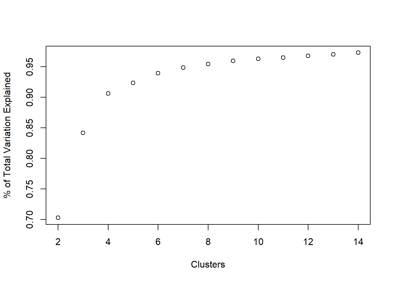
Where does the elbow occur in the above plot? That’s pretty subjective (a common theme in unsupervised learning), but for our task we would prefer to have \(\leq 10\) clusters, probably.
Visualize AIC
We could also opt for the AIC, which basically looks at how well the clusters are fitting to the data, while also penalizing how many clusters are in the final fit. The general rule with AIC is that lower values are better.
First, we define a function which calculates the AIC from the output of kmeans.
kmeansAIC <- function(fit){

  m = ncol(fit$centers)
  k = nrow(fit$centers)
  D = fit$tot.withinss
  return(D + 2*m*k)

}
aic_k <- sapply(2:14, FUN =
function(k)
kmeansAIC(kmeans(b_housing, centers = k, nstart = 20, iter.max = 25)))
plot(2:14, aic_k, xlab = 'Clusters', ylab = 'AIC from kmeans')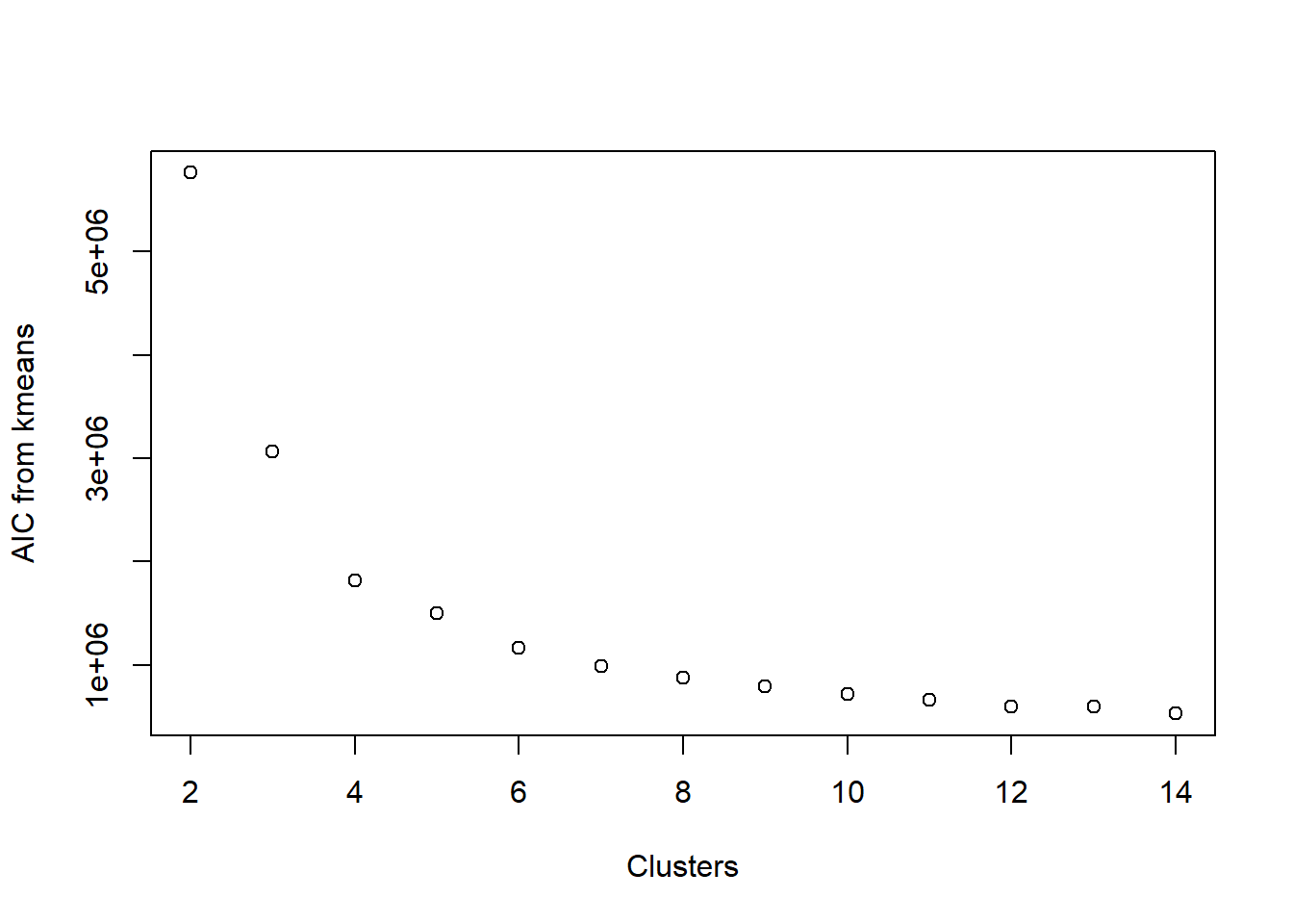
Look familiar? It is remarkably similar to looking at the SSE. This is because the main component in calculating AIC is the within-cluster sum of squared errors. Once again, we’re looking for an elbow in the plot, indicating that the decrease in AIC is not happening so rapidly.
Visualize BIC
BIC is related to AIC in that BIC is AIC’s conservative cousin. When we evaluate models using BIC rather than AIC as our metric, we tend to select smaller models. Calculating BIC is rather similar to that of AIC (we replaced 2 in the AIC calculation with log(n)):
kmeansBIC <- function(fit){
  m = ncol(fit$centers)
  n = length(fit$cluster)
  k = nrow(fit$centers)
  D = fit$tot.withinss
  return(D + log(n) * m * k) # using log(n) instead of 2, penalize model complexity
}
bic_k <- sapply(2:14, FUN =
function(k)
kmeansBIC(kmeans(b_housing, centers = k, nstart = 20, iter.max = 25)))
plot(2:14, aic_k, xlab = 'Clusters', ylab = 'BIC from kmeans')
Once again, the plots are rather similar for this toy example.
Wrap it all together in kmeans2
We can wrap all the previous parts together in a function to get a broad look at the fit of kmeans.
We’ll fit kmeans across a range of centers (center_range). Using the results from these fits, we’ll look at AIC, BIC, within cluster variation, and the % of total variation explained. We can choose to spit out a table to the user (plot = FALSE) or we’ll plot each of the four metrics by the number of clusters (plot = TRUE).
kmeans2 <- function(data, center_range, iter.max, nstart, plot = TRUE){

  #fit kmeans for each center
  all_kmeans <- lapply(center_range,
                       FUN = function(k)
                         kmeans(data, center = k, iter.max = iter.max, nstart = nstart))

  #extract AIC from each
  all_aic <- sapply(all_kmeans, kmeansAIC)
  #extract BIC from each
  all_bic <- sapply(all_kmeans, kmeansBIC)
  #extract tot.withinss
  all_wss <- sapply(all_kmeans, FUN = function(fit) fit$tot.withinss)
  #extract between ss
  btwn_ss <- sapply(all_kmeans, FUN = function(fit) fit$betweenss)
  #extract totall sum of squares
  tot_ss <- all_kmeans[[1]]$totss
  #put in data.frame
  clust_res <-
    data.frame('Clusters' = center_range,
             'AIC' = all_aic,
             'BIC' = all_bic,
             'WSS' = all_wss,
             'BSS' = btwn_ss,
             'TSS' = tot_ss)
  #plot or no plot?
  if(plot){
    par(mfrow = c(2,2))
    with(clust_res,{
      plot(Clusters, AIC)
      plot(Clusters, BIC)
      plot(Clusters, WSS, ylab = 'Within Cluster SSE')
      plot(Clusters, BSS / TSS, ylab = 'Prop of Var. Explained')
    })
  }else{
    return(clust_res)
  }

}


kmeans2(data = b_housing, center_range = 2:15, iter.max = 20, nstart = 25)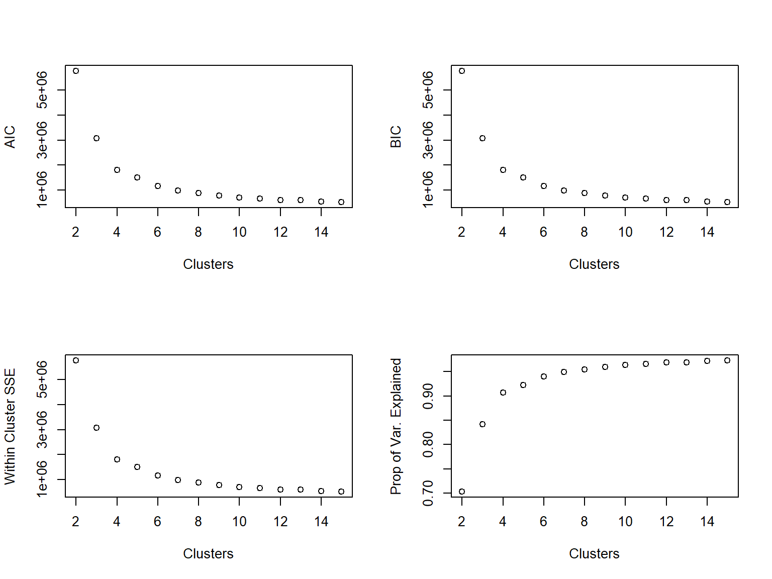
Use a package to determine k
This is R after all, so surely there must be at least one package to help in determining the “best” number of clusters. NbClust is a viable option.
library(NbClust)

best.clust <- NbClust(data = b_housing,
                      min.nc = 2,
                      max.nc = 15,
                      method = 'kmeans')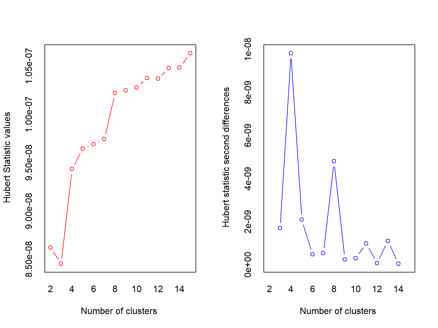
## *** : The Hubert index is a graphical method of determining the number of clusters.
##                 In the plot of Hubert index, we seek a significant knee that corresponds to a
##                 significant increase of the value of the measure i.e the significant peak in Hubert
##                 index second differences plot.
## 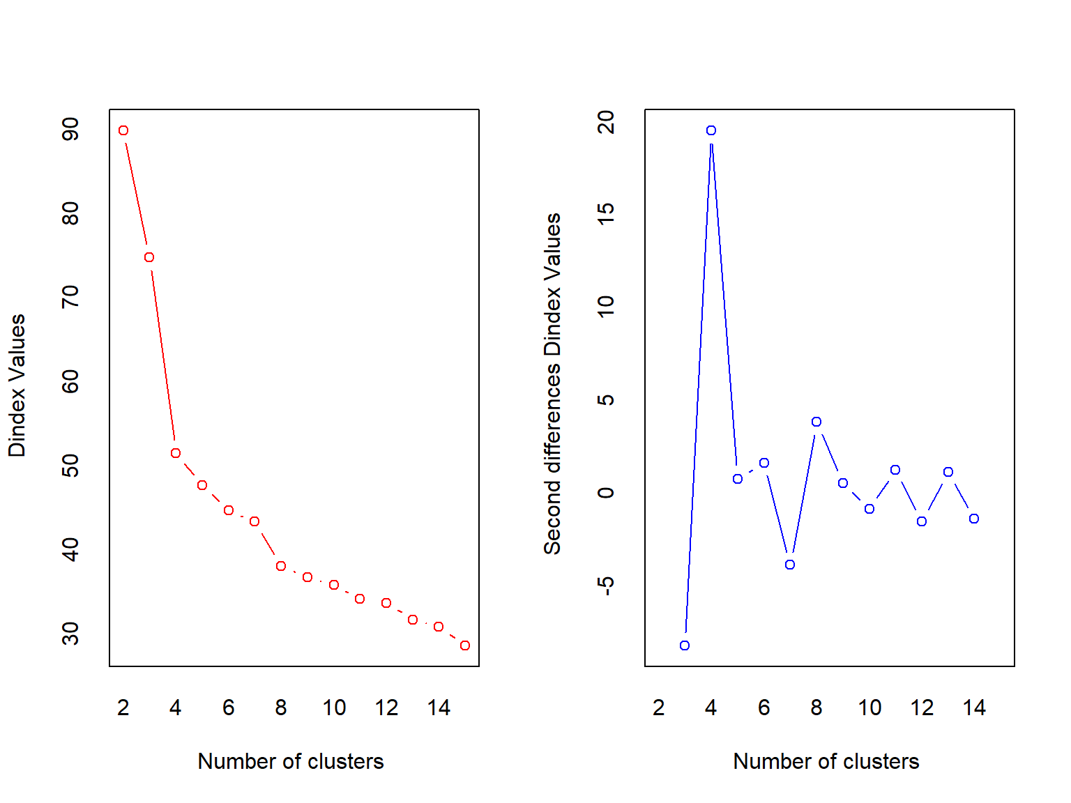
## *** : The D index is a graphical method of determining the number of clusters.
##                 In the plot of D index, we seek a significant knee (the significant peak in Dindex
##                 second differences plot) that corresponds to a significant increase of the value of
##                 the measure.
##
## *******************************************************************
## * Among all indices:
## * 7 proposed 2 as the best number of clusters
## * 2 proposed 3 as the best number of clusters
## * 12 proposed 4 as the best number of clusters
## * 1 proposed 5 as the best number of clusters
## * 1 proposed 8 as the best number of clusters
## * 1 proposed 15 as the best number of clusters
##
##                    ***** Conclusion *****
##
## * According to the majority rule, the best number of clusters is  4
##
##
## *******************************************************************
NbClust returns a big object with some information that may or may not be useless for this use case (I stored the rest of the output in best.clust, but the package still spit out a bunch of stuff). But, it does tell you the best number of clusters as selected by a slew of indices. This function must iterate through all the possible clusters from min.nc to max.nc, so it may not be very quick, but it does give another way of selecting the number of clusters.
You may want to find a reasonable range for min.nc and max.nc before resorting to the NbClust function. If you know that 3 clusters won’t be enough, don’t make NbClust even consider it as an option.
There’s also an argument called index in the NbClust function. This value controls which indices are used to determine the best number of clusters. The calculation methods differ between indices and if your data isn’t so nice (e.g. variables with few unique values), the function may fail. The default value is all, which is a collection of 30 (!) indices all used to help determine the best number of clusters.
It may be helpful to try different indices such as tracew, kl, dindex or duda. Unfortunately, you’ll need to specify only one index for each NbClust call (unless you use index = 'all' or index = 'alllong').
For more details look at the function’s documentation.
Visualizing the centroids
This function helps to visualize the centroids for each cluster. It can allow for interpretation of clusters.
The arguments for this function are fit, levels, and show_N:
fit: object returned from a call tokmeanslevels: a character vector representing the levels of the variables in the data set used to fitkmeans, this vector will allow a user to control the order in which variables are plottedshow_N: a logical value, if TRUE, the plot will contain information about the size of each cluster, if FALSE, a table of counts will be printed prior to the plot
To use the levels argument, the character vector you supply must have the same number of elements as the number of unique variables in the data set used to fit the kmeans. If you specify levels = c('a','b','c') the plotting device will display (from top to bottom) 'c','b','a'. If you are not satisfied with the plotting order, the rev function may come in handy.
kmeans_viz <- function(fit, levels = NULL, show_N = TRUE){
  require(ggplot2)
  require(dplyr)
  #extract number of clusters
  clusts <- length(unique(fit$cluster))
  #centroids
  kmeans.table <- as.data.frame(t(fit$center), stringsAsFactors = FALSE)
  #variable names
  kmeans.table$Variable <- row.names(kmeans.table)
  #name clusters
  names(kmeans.table)[1:clusts] <- paste0('cluster', 1:clusts)
  #reshape from wide table to long (makes plotting easier)
  kmeans.table <- reshape(kmeans.table, direction = 'long',
                        idvar = 'Variable',
                        varying = paste0('cluster', 1:clusts),
                        v.names = 'cluster')

  #number of observations in each cluster
  #should we show N in the graph or just print it?
  if(show_N){
    #show it in the graph
  kmeans.table$time <- paste0(kmeans.table$time,
                             ' (N = ',
                             fit$size[kmeans.table$time],
                             ')')
  }else{
    #just print it
    print(rbind('Cluster' = 1:clusts,
          'N' = fit$size))
  }
  #standardize the cluster means to make a nice plot
  kmeans.table %>%
    group_by(Variable) %>%
    mutate(cluster_stdzd = (cluster - mean(cluster)) / sd(cluster)) -> kmeans.table
  #did user specify a variable levels vector?
  if(length(levels) == length(unique(kmeans.table$Variable))){
    kmeans.table$Variable <- factor(kmeans.table$Variable, levels = levels)
  }

  #make the plot
  ggplot(kmeans.table, aes(x = Variable, y = time))+
    geom_tile(colour = 'black', aes(fill = cluster_stdzd))+
    geom_text(aes(label = round(cluster,2)))+
    coord_flip()+
    xlab('')+ylab('Cluster')+
    scale_fill_gradient(low = 'white', high = 'grey60')+
    theme_bw()+
    theme(legend.position = 'none',
          axis.title.y = element_blank(),
          axis.title.x = element_text(size = 16),
          panel.grid = element_blank(),
          axis.text = element_text(size = 14),
          axis.ticks = element_blank())

}

opt.kmeans <- kmeans(b_housing, centers = 4, nstart = 50, iter.max = 50)

kmeans_viz(opt.kmeans)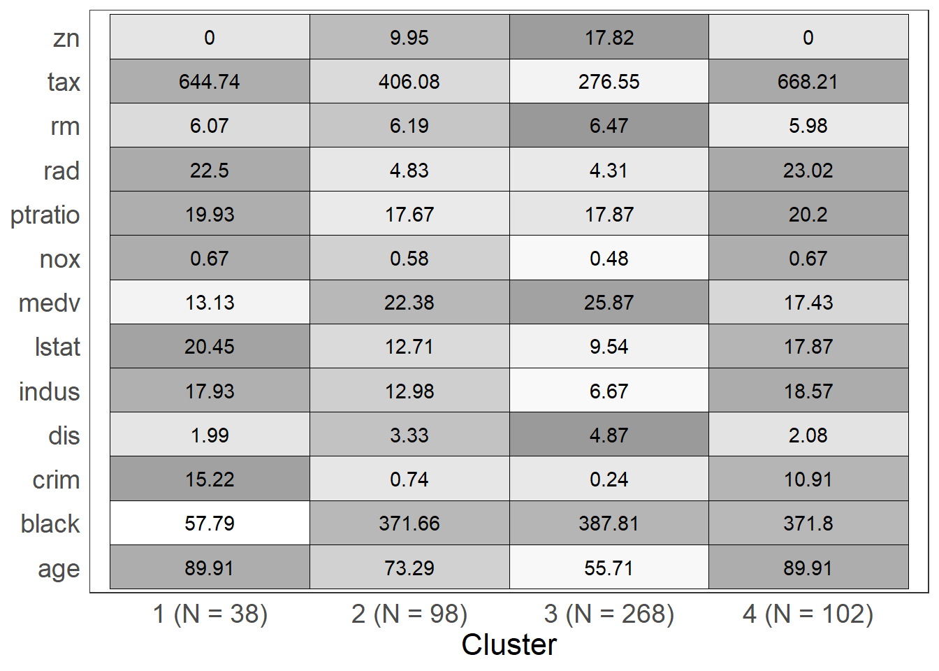
Using kmeans to predict
We can predict cluster membership using a few techniques. For the simple plug-and-play method, we can use the cl_predict function from the clue package. For those interested in a more manual approach, we can calculate the centroid distances for the new data, and select whichever cluster is the shortest distance away.
I will demonstrate both techniques.
First, we’re going to select a subset of the Boston dataset to fit a kmeans on. Using the result of kmeans fit on b_hous.train, we’ll try to predict the clusters for a “new” dataset, b_hous.test.
#rows to select
set.seed(123)
train_samps <- sample(nrow(b_housing), .7 * nrow(b_housing), replace = F)
#create training and testing set
b_hous.train <- b_housing[train_samps,]
b_hous.test <- b_housing[-train_samps,]

#fit our new kmeans
train.kmeans <- kmeans(b_hous.train, centers = 4, nstart = 50, iter.max = 50)
Use cl_predict
The interface is fairly simple to get the predicted values.
We’re going to use system.time to time how long it takes R to do what we want it to.
library(clue)

system.time(
  test_clusters.clue <- cl_predict(object = train.kmeans, newdata = b_hous.test)
  )
## user system elapsed
## 0.02 0.00 0.02table(test_clusters.clue)## test_clusters.clue
## 1 2 3 4
## 84 15 27 26By hand
Taken from this nice CrossValidated solution.
clusters <- function(x, centers) {
  # compute squared euclidean distance from each sample to each cluster center
  tmp <- sapply(seq_len(nrow(x)),
                function(i) apply(centers, 1,
                                  function(v) sum((x[i, ]-v)^2)))
  max.col(-t(tmp))  # find index of min distance
}

system.time(
  test_clusters.hand <- clusters(x = b_hous.test, centers = train.kmeans$centers)
  )
## user system elapsed
## 1.81 0.00 1.81table(test_clusters.hand)## test_clusters.hand
## 1 2 3 4
## 84 15 27 26all(test_clusters.hand == test_clusters.clue) #TRUE## [1] TRUEWe see that clusters is slower than cl_predict, but they return the same result. It would be prudent to use cl_predict.
Wrapping Up
In this post I walked through the kmeans algorithm, and its implementation in R. Additionally, I discussed some of the ways to select the k in kmeans. The process of selecting and evaluating choices of k will vary from project to project and depend strongly on the goals of an analysis.
It is worth noting that one of the drawbacks of kmeans clustering is that it must put every observation into a cluster. There may be anomalies or outliers present in a dataset, so it may not always make sense to enforce the condition that each observation is assigned to a cluster. A different unsupervised learning technique, such as dbscan (density-based spatial clustering of applications with noise) may be more appropriate for tasks in which anomaly detection is necessary. I hope to explore this technique in a future post. In the meantime, here’s an example of Netflix applying dbscan for anomaly detection.