Jake Low wrote a really interesting piece that presented a few data visualizations that went beyond the typical 2016 election maps we’ve all gotten used to seeing.
I liked a lot of things about Jake’s post, here are three I was particularly fond of:
- His color palette choices
- Each color palette that was used had solid perceptual properties and made sense for the data being visualized (i.e. diverging versus sequential)
- He made residuals from a model interesting by visualizing and interpreting them
- He explained the usage of a log-scale transformation in an intuitive way, putting it in terms of the data set being used for the analysis.
In this post, I’m going to replicate Jake’s analysis and then extend it a bit, by fitting a model which is a little more complicated than the one is his post.
In Jake’s post, he used d3.js to do most of the work. As usual, I’ll be using R.
Since this is R, here are the packages I’ll need:
library(tidyverse)
library(tidycensus)
library(ggmap)
library(scales)
library(maps)
Getting the Data
For this analysis, we’ll need a few different data sets, all measured at the county level:
- 2016 election results
- Population density
- Educational information (how many people over 25 have some college or associate’s degree)
- Median income
- 2012 election results
I got election results from this GitHub repository. I plan on making a few heatmaps with this data, so I’m only including information from the contiguous United States. There’s also an issue I don’t fully understand with Alaska vote reporting, where it seems as though county-level reporting doesn’t exist.
github_raw <- "https://raw.githubusercontent.com/"
repo <- "tonmcg/County_Level_Election_Results_12-16/master/"
data_file <- "2016_US_County_Level_Presidential_Results.csv"
results_16 <- read_csv(paste0(github_raw, repo, data_file)) %>%
  filter(! state_abbr %in% c('AK', 'HI')) %>%
  select(-X1) %>%
  mutate(total_votes = votes_dem + votes_gop,
         trump_ratio_clinton =
           (votes_gop/total_votes) / (votes_dem/total_votes),
         two_party_ratio = (votes_dem) / (votes_dem + votes_gop)) %>%
  mutate(log_trump_ratio = log(trump_ratio_clinton))
To get some extra information about the counties I’ll use the tidycensus package. For each county, I’m pulling information about the population over 25, the number of people over 25 with some college or associate’s degree, and the median income.
census_data <- get_acs('county',
                   c(pop_25 = 'B15003_001',
                     edu = 'B16010_028',
                     inc = 'B21004_001')) %>%
  select(-moe) %>%
  spread(variable, estimate)
Finally, I pulled in information about population density from the Census American FactFinder. Once I downloaded that data, I threw it into a GitHub repo.
Recreating Jake’s Analysis
Election and Population Density Maps
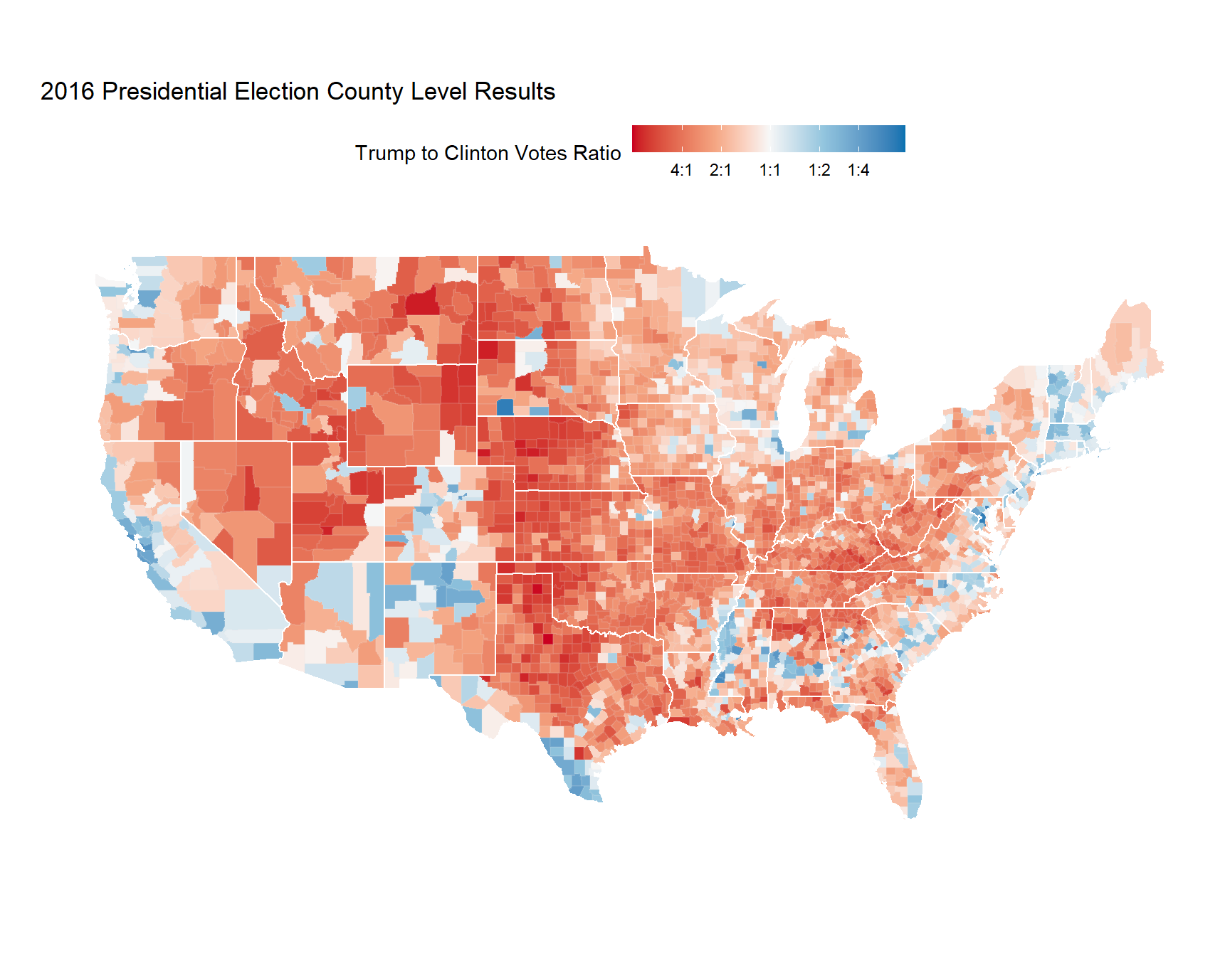
First, we’re going to make the 2016 election map.
I’ll be making all of the maps in this post using ggplot2. I’ve removed the code from this post, but if you look on my GitHub, you’ll notice some funky stuff going on with scale_fill_gradientn. To make the map more visually salient, I’ve played around a bit with how the colors are scaled.
Counties that are red voted more for Trump, and counties that are blue voted more for Clinton.
Then we’ll take a look at population density. Again, I’ve hidden the code to make this map, but I’ve used ggplot2 to visualize the data, and I used one of the virdis color palettes (which is what Jake did as well).
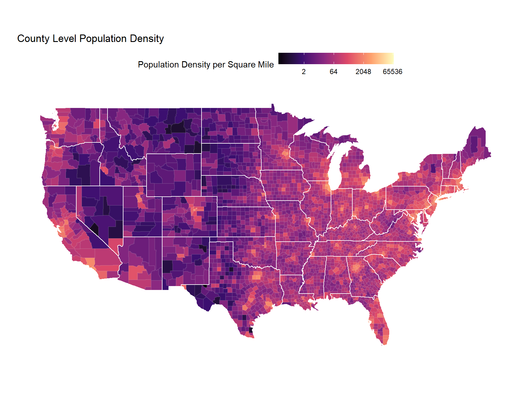
If you look between the two maps, you might get a sense of the correlation between population density and the 2016 election results. It’s reasonable to expect that we might be able to do a decent job at predicting election results just using population density.
Predicting 2016 with Population Density
Finally, we’re going to try to predict the 2016 election results using population density.
First, let’s examine a scatter plot of the data.
results_and_pop_density <- results_16 %>%
  inner_join(pop_density, by = c('combined_fips' = 'FIPS')) %>%
  mutate(two_party_ratio = (votes_dem) / (votes_dem + votes_gop))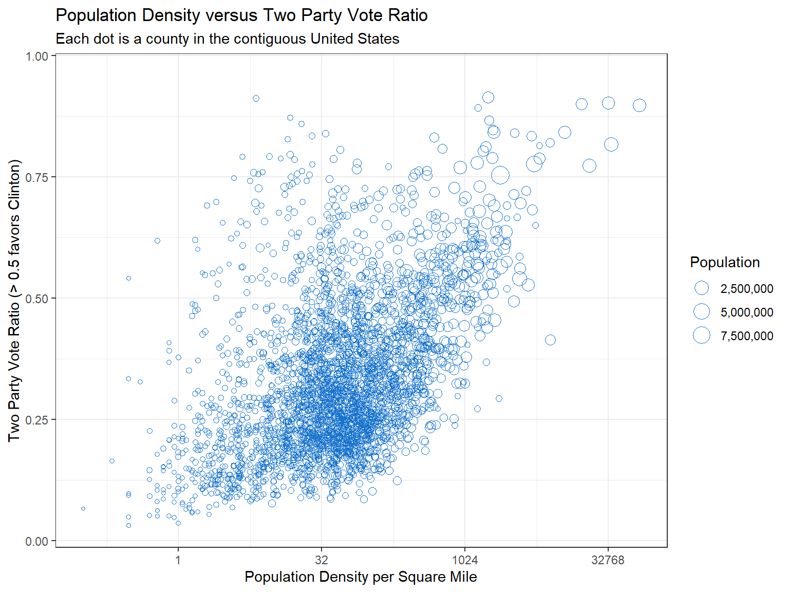
We’re going to fit a linear model which tries to predict the Two Party Vote Ratio \(\frac{N_{clinton}}{N_{clinton}+N_{trump}}\) using population density. Calculating the two party ratio in the way we have means that a county over 0.5 favored Clinton.
model1 <- lm(two_party_ratio ~ I(log(population_density)),
             data = results_and_pop_density)
# extract residuals
# negative values underestimate Trump (prediction is too high)
# positive values underestimate Clinton (prediction is too low)
results_and_pop_density$resid_model1 <- resid(model1)
I’m hiding the code used to generate the map, but what we’re visualizing isn’t actually what the model predicted. Instead, we’re visualizing the residuals, which tell us about how good or bad the model’s prediction is. Calculating residuals is straightforward (we just see how far off our prediction was from the actual observed value):
\[\text{residual} = \text{actual proportion} - \text{predicted proportion}\]
The larger the residual (in absolute value), the farther the model was from being right for that observation. Analyzing residuals and learning more about where your model is wrong can be one of the most fascinating parts of statistics and data science.
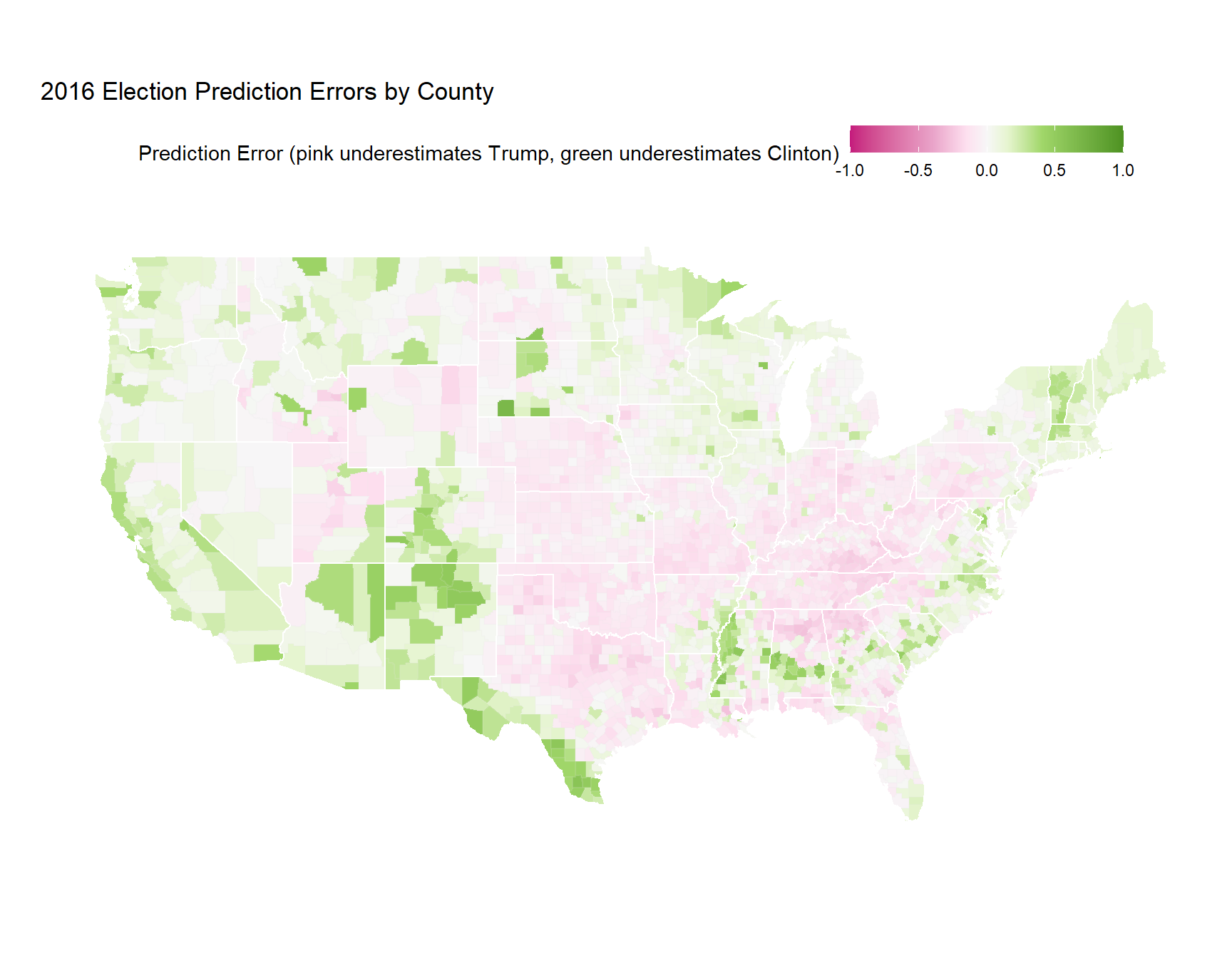
In my opinion, visualizing the residuals from this simple model tells an even more interesting story than the election map above.
For example, look at the southwest corner of Texas, which had much higher rates of Clinton favorability than the model predicted. Additionally, this map also shows Trump’s appeal through the middle of the country. Much of the nation’s “breadbasket” is colored pink, indicating that these counties favored Trump much more than the model predicted.
Extending Jake’s Analysis
My first thought after Jake’s post was that the model he built was pretty simple. There are a few other variables it would be good to adjust for.
What would the previous residual map look like if we controlled for factors like education, income, and age? How about if we add in the two party ratio from the 2012 election (which came from this GitHub repository)?
We’re also going to deviate from the linear model we fit before. I think it would make more sense to fit a logistic regression instead of a linear model, since the thing we want to predict is a proportion (it lives on the range \([0,1]\)), not necessarily a continuous value (which lives on the range \((-\infty, \infty)\)).
I would hope that building a more robust model would make the residual map even more interesting. Let’s see what happens!
# fit logistic regression
model2 <- glm(cbind(votes_dem, votes_gop) ~ I(log(population_density))+
                I(log(inc))+edu_pct + state_abbr + I(log1p(two_party_2012)),
              data = results_pop_census,
              family = 'binomial',
              na.action = na.exclude)
# extract residuals
results_pop_census$resid_model2 <- resid(model2, type = 'response')
# join up to geographic data
results_pop_census_map <- county_map_with_fips %>%
  inner_join(results_pop_census, by = c('fips' = 'combined_fips'))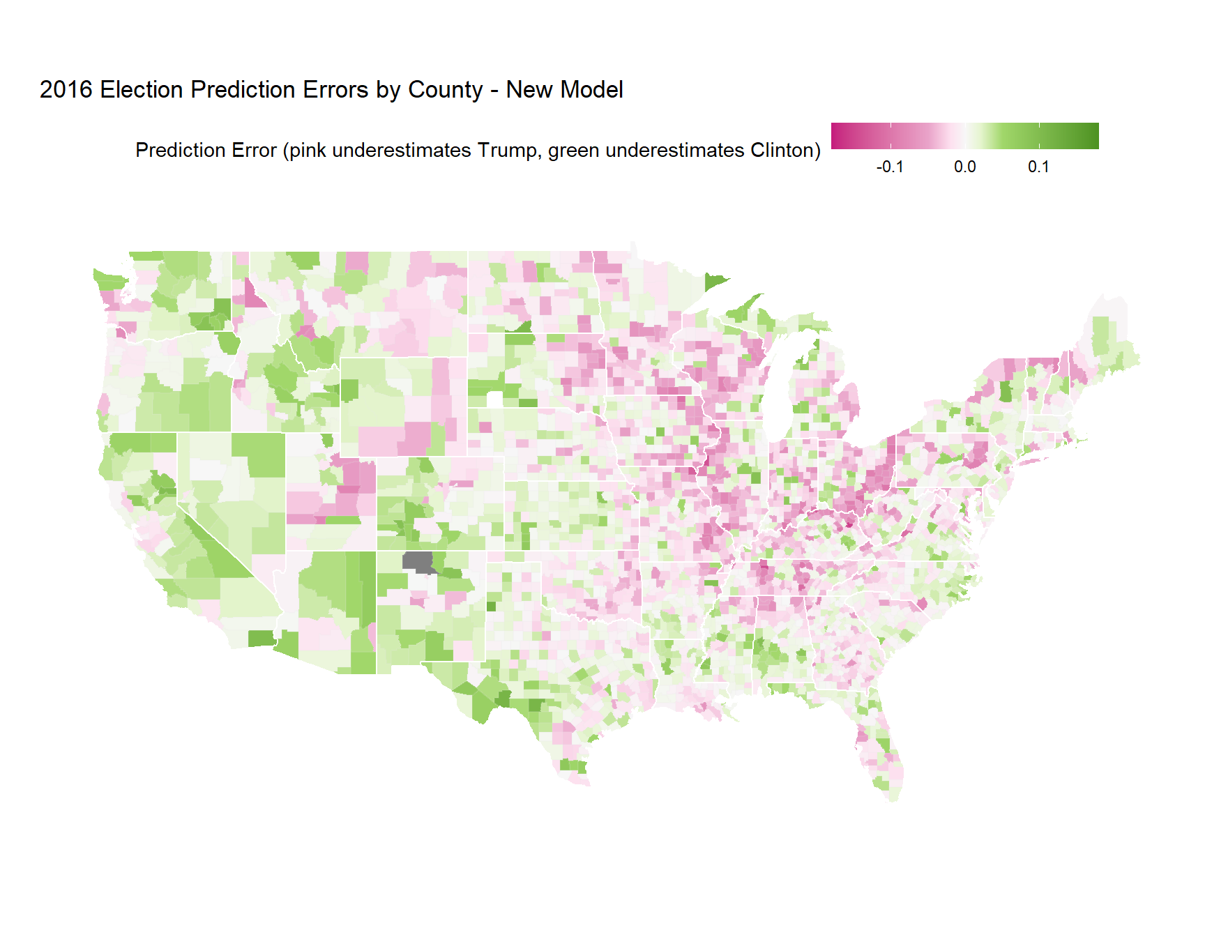
A few things are noticeably different between the two maps:
- The upper Midwest is considerably pinker than the previous map. Incorporating the 2012 election results demonstrates how conventional wisdom resulted in poor predictions for 2016.
- Adding variables to the model substantially improved the fit. Notice how the range for the residuals is now much smaller.
- Parts of the Northeast are now much pinker as well. Trump’s vow to bring back coal jobs resonated with this area of the country.
Some things stayed the same:
- The southwestern corner (i.e. border towns) of Texas are still green (Clinton performed better than the model would have predicted).
- The “breadbasket” or “flyover” part of the country is still pink (Trump performed better than the model would have predicted).
- Most coastal population centers are green (Clinton performed better than the model would have predicted).
We can also look at counties where the model was most wrong, to see if there are any interesting patterns at the highest level.
top_n(results_pop_census, 10, resid_model2) %>%
    bind_rows(top_n(results_pop_census, 10, -resid_model2)) %>%
    ggplot(aes(reorder(paste0(county_name, ', ', state_abbr), resid_model2), resid_model2))+
    geom_col(aes(fill = resid_model2), colour = 'black')+
    coord_flip()+
    scale_fill_gradientn(values = rescale(c(-.18, -.05, -.02, 0, .02, .05, .18)),
                         colours = brewer_pal(palette = 'PiYG')(7),
                         limits = c(-.18, .18),
                         name = 'Prediction Error (pink underestimates Trump, green underestimates Clinton)')+
    theme(legend.position = 'none')+
    xlab('')+
    ylab('Prediction Error (pink underestimated Trump, green underestimated Clinton)')+
    ggtitle('Counties with the Highest Prediction Errors',
            subtitle = 'Top 10 over- and under-predictions selected')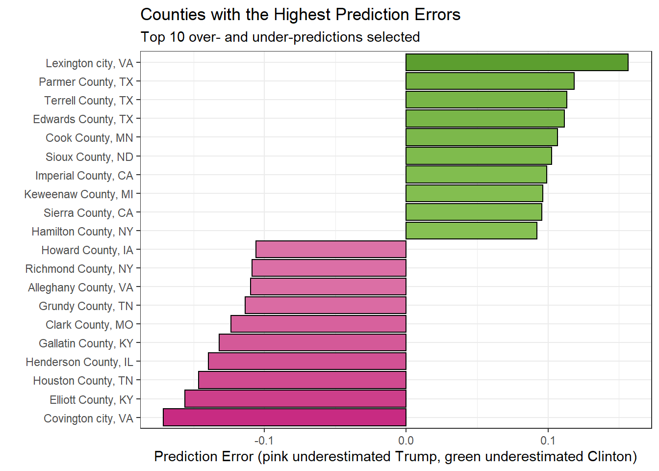
In the above plot, we can see that three of the highest ten errors in favor of Clinton (the county performed better for Clinton than the model predicted) were from Texas. More analysis showed that five of the highest twenty five errors in favor of Clinton were in Texas. For Trump, Virginia, Kentucky, and Tennessee each had two counties in the top 10.
Finally, we can look at how wrong our new-and-improved model was across states. There are a few ways to summarize residuals over states (we could even build another model that predicted state results), but I’ll opt for the simplest route, and calculate the median error for each state.
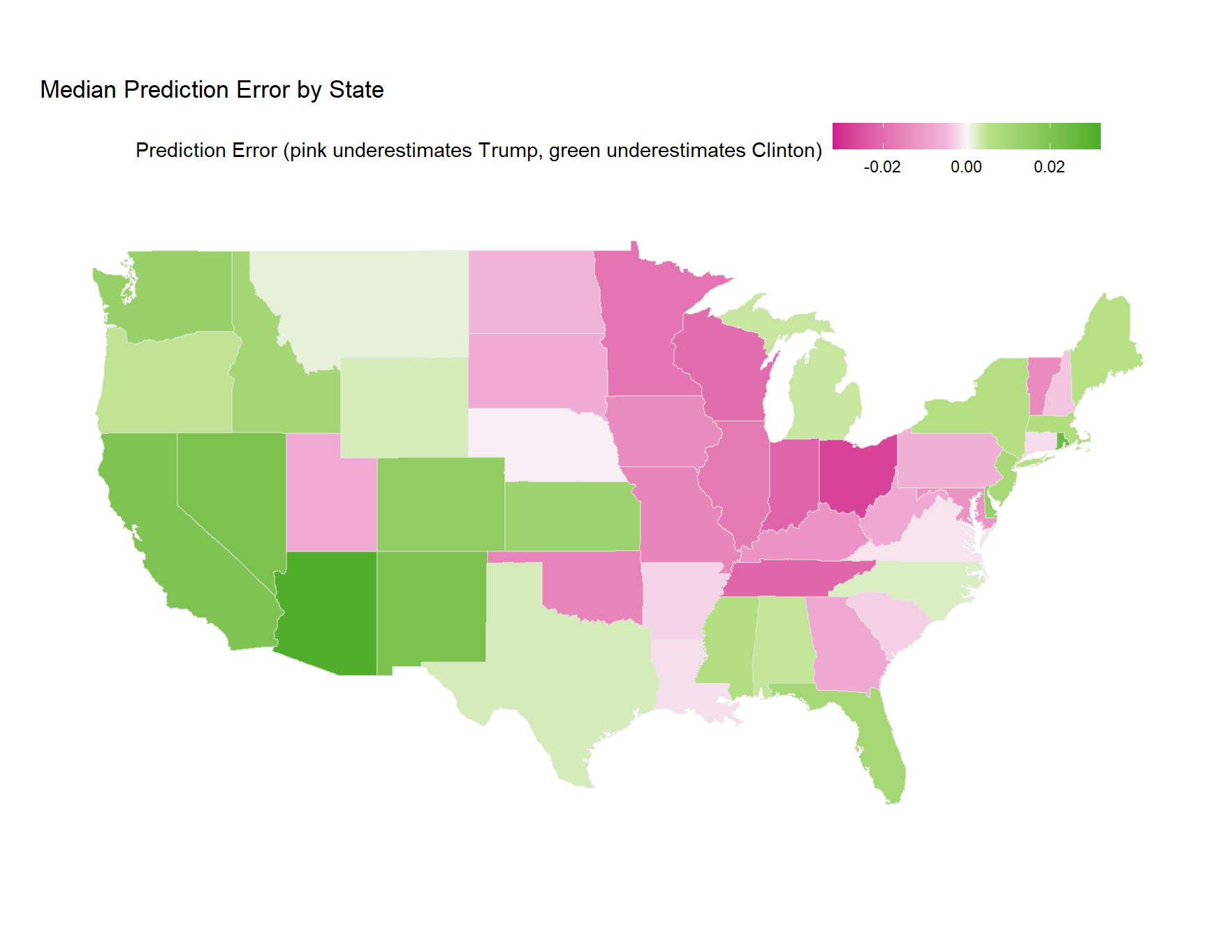
Simply calculating the median prediction error tells an interesting story about the 2016 election. We see the Midwest lighting up in pink, indicating areas where Trump out-performed the expectations of the model. We see areas out west where Clinton out-performed the expectations of the model. Finally, we see areas which are colored faintly, indicating that the model’s median prediction error was fairly close to 0.
Conclusion
I wanted to build on the great work of Jake Low and demonstrate how going a bit deeper with our model fitting can allow us to refine the data stories we tell. I also wanted to take his analysis (done in d3.js) and demonstrate how it could be replicated in R.
I think the key takeaway from this post is that investigating the residuals from a model can result in some revelatory findings from a data analysis. Our models will always be wrong, but understanding and telling a story about what they got wrong can make us feel a little better about that fact.
Thanks for reading through this post. If you want to look at the code for this analysis, you can find it on my GitHub. Let me know what you thought about my post. Did any of the maps surprise you?